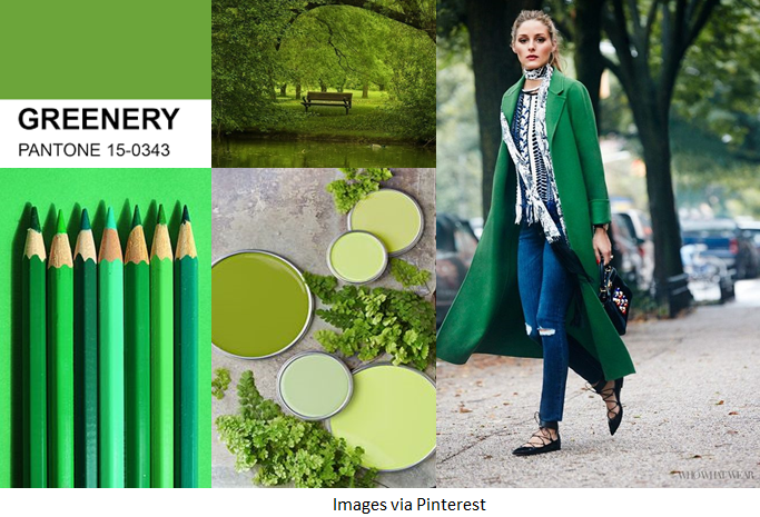
“A refreshing and revitalising shade, Greenery is symbolic of new beginnings.”

Most shades of green are associated with nature and Pantone’s ‘Greenery’, which is very similar to Apple Green in our colour me beautiful swatches, is a zesty, yellow green tone, making it perfect for those of you who fall into our Light dominant colour category and who have a Warm undertone!
The way you wear this shade will vary depending on your dominant colour category, here are a few tips from us on how to wear this stunning shade!
DEEP AND CONTRASTING
If you fall into the Deep or Clear dominant colour category you ideally want to pair Greenery with a contrasting shade. Neutrals like Charcoal and Black Brown will work well. You could also pair Greenery with Damson for a rich, contrasting combination or Lapis to provide a striking pop of colour.
LIGHT AND DELICATE
Those of you who fall into the Light dominant colour category will want to add a shade of a similar, or slightly lighter depth to Greenery, to complement your colouring. Try wearing it with subtle colours like Soft White, Shell or even Powder Blue, which will give a lovely, fresh feel to your look as we move into Spring.
GO GREEN!
If you fall into the Warm dominant colour category you may wish to wear Greenery all on its own, or with some simple gold jewellery; either way, it will certainly complement your warm colour characteristics. Those who are Dramatic and Warm may want to try some more unusual colour combinations, perhaps a pop of Pumpkin or Primrose to really spice things up!
Not sure if Greenery is in your palette? Contact us to find out!
